Project File / 17 / Brand and web systems
The website had to feel like the way the engineers work
Brand, web design, and frontend delivery for a senior-led engineering partner built around direct access, practical judgment, and no handoff theatre.
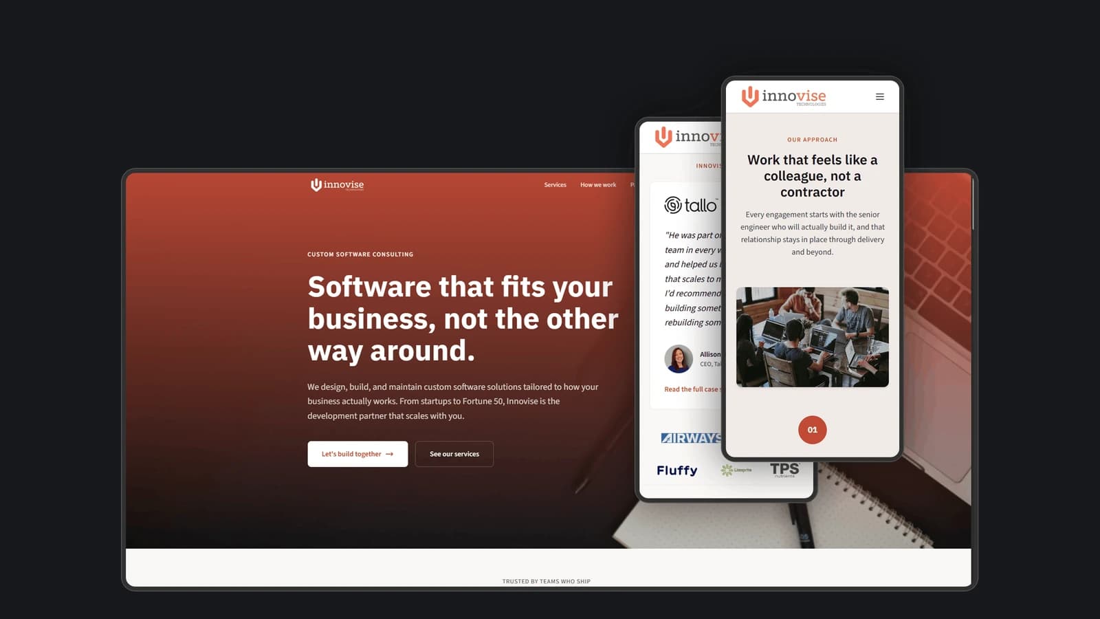
Most software agencies describe capacity. Innovise needed to describe a working relationship: senior engineers inside the problem, direct access to the person doing the work, and no account-management layer translating every decision.
My work covered the brand, web design, and frontend delivery for that public story. The site had to feel calm, direct, and experienced without making the usual agency mistake of replacing evidence with a wall of capability claims.
17.01
One sentence carried the operating model
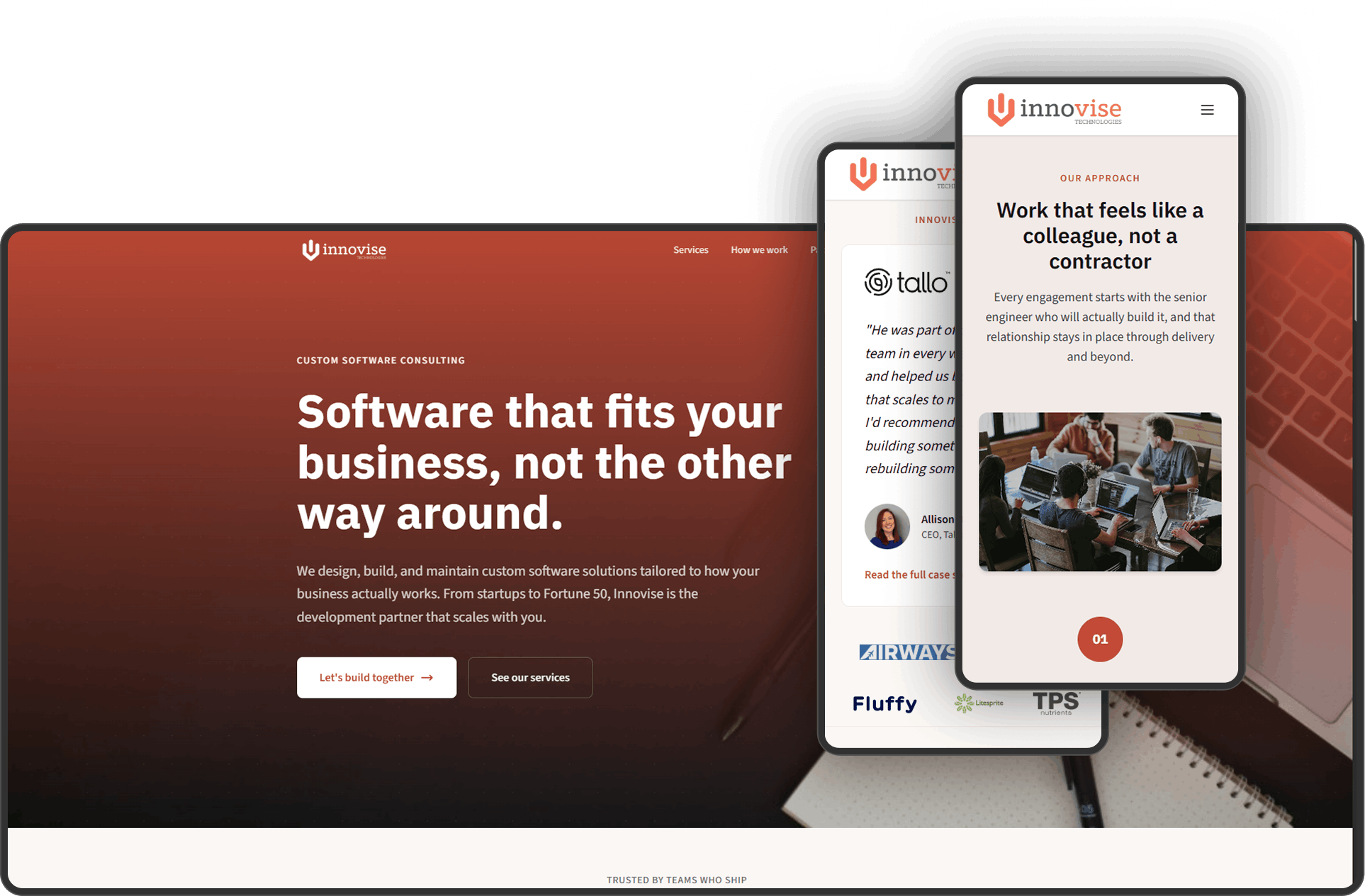
The live headline is the whole positioning system in miniature: Engineering that feels like a colleague, not a vendor. It explains the relationship before the page asks a visitor to decode a service list.
That promise shapes the rest of the page. The same engineer stays involved from discovery through delivery, and the language stays focused on what the client is trying to accomplish rather than on process for its own sake.
Positioning ruleName the relationship the buyer wants before listing the things the team can do.
17.02
The services needed one coherent shape
The public offer spans embedded development, custom software, AI engineering, production stabilization, internal team development, audits, and fractional CTO work. That range could easily read like a generic consultancy menu.
The information architecture keeps the services attached to one senior-led model. Cards explain the job in plain language, the process section shows discover, build, and deliver, and the founder section makes responsibility visible instead of hiding it behind a logo wall.
17.03
Restraint was part of the proof
A senior engineering partner does not need a site that performs cleverness at the visitor. The interface uses a restrained earth-toned system, large editorial type, simple service cards, direct calls to action, and enough space for the message to carry the page.
The live result works as a responsive marketing surface with service paths, case-study proof, booking, and a contact route. The design job was making that breadth feel focused rather than making every capability equally loud.
Craft testThe brand should make experienced judgment feel obvious before the copy has to insist on it.
17.04
This file stops before the client relationship becomes private
No client contracts, internal operations, prospect data, delivery details, or private commercial metrics are included here.
The career signal is public and bounded: brand positioning, information architecture, responsive web design, frontend delivery, and the judgment to make a service business legible without turning it into agency wallpaper.
What survived
Three things I would carry into the next build
- A strong service brand makes the operating model visible, not just the capability list.
- Information architecture can turn a broad offer into one coherent promise.
- Restraint communicates confidence when the relationship is the product.